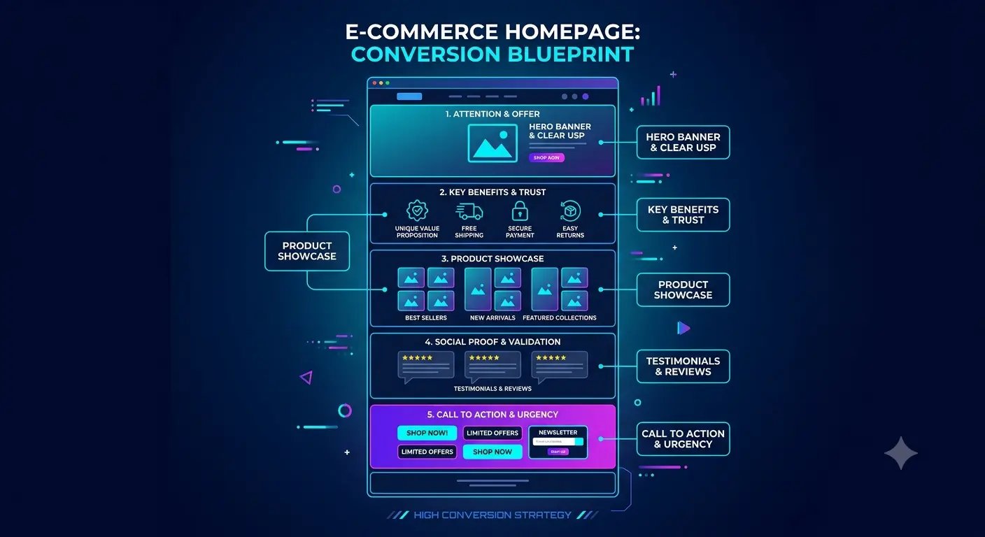
🏠 Online Store Homepage Structure That Converts
The homepage is the first conversion point of your store. It is where most buyers begin their journey, and it is where you lose (or keep) most of your revenue — without any ad spend. Let's break down the must-have blocks that turn an ordinary storefront into a selling page.
📄 Table of contents
- Why homepage structure determines conversion
- First screen: offer, headline and first seconds
- Benefits block: why buy from you
- Catalog, categories and product sets
- Trust block: reviews, delivery, guarantees
- Calls to action and handling objections
- Common homepage structure mistakes
- Useful resources and instructions
🎯 1. Why homepage structure determines conversion
The homepage is your storefront. According to most studies, a visitor decides whether to stay on the site or leave within the first 3–5 seconds. If by that time they haven't understood what you sell, why they need it and why they should trust you — they leave to a competitor. No ad money pays off if the homepage doesn't "push through" the traffic.
Conversion in an online store is not about miracles or "cheap and fast". It's about a clear offer, addressed objections and an understandable path to purchase. The right page structure arranges these elements in the right order, and sales grow without increasing the ad budget.
⚙ What should be on the homepage from a technical standpoint
🖼 Loading speed
Every extra second of loading reduces conversion by 4–7%. Compressed code, WebP images and lazy loading are the must-have minimum. More in the section on performance optimization.
📱 Responsiveness
Over 60–70% of buyers come from phones. Blocks must collapse correctly into one column, and CTAs must stay easy to tap. Read the guide to the mobile version of the store.
🧭 Clear structure
Headlines, subheadings and CTAs should guide the visitor along a logical route: understood → interested → trusted → bought. A chaotic set of blocks scatters attention and kills conversion.
🔍 SEO foundation
The homepage is the index. Proper meta tags, Schema.org, hreflang and a sitemap help promote it. See Schema.org markup for products.
🖼 2. First screen: offer, headline and first seconds
The first screen (hero-section) is the part of the page the visitor sees immediately, without scrolling. This is where it's decided in 3–5 seconds whether they close the tab or keep reading. This block sells three things: what you sell, to whom and why exactly you.
🧩 What the first screen consists of
On the BooStore platform, the first screen is easy to assemble from ready-made header and banner blocks using the visual blocks library — it includes ready headlines, split sections and icons that are already adapted for mobile.
✅ 3. Benefits block: "Why buy from you"
After the first screen, the visitor asks the main question: "why are you better than competitors?". The benefits block answers it with 5 icons or cards. It works on emotional and rational persuasion at the same time.
Typical benefits that sell in an online store: free or fast delivery, return guarantee, cash on delivery, wide assortment, real photos, 24/7 support. But it's important to tell the truth and back each benefit with specifics, not general words.
| Benefit | Weak wording | Strong wording |
|---|---|---|
| Delivery | "Fast delivery" | "Delivery in 24 hours across the country" |
| Assortment | "Big choice" | "Over 5,000 models in stock" |
| Returns | "Returns possible" | "14-day no-questions-asked returns" |
| Payment | "Various payment methods" | "Pay on delivery or online by card" |
📦 4. Catalog, categories and product sets
The catalog on the homepage is the bridge between the first screen and a specific product. Here the visitor starts "browsing" and imagining themselves with the purchase. The clearer the structure, the faster they find what they need and the less they think.
🗂 What must be there
The main sections of the store (clothing, electronics, footwear) displayed large and clearly. The visitor must immediately choose their search path. About configuring sections — store categories guide.
"Bestsellers", "New arrivals", "Sales", "Top sellers" — targeted selections of products that push toward a purchase. Show 8 to 12 products per block.
The storefront shows the price, old/new value and availability right away. A transparent price lowers fear and reduces abandoned carts.
Duplicate the full search and filter by product types so the buyer finds what they need in a couple of clicks. More in the guide on attributes and filters.
On BooStore, product blocks on the homepage are displayed via "Widgets" and "Blocks/Menus". A handy tool — the product widget, which shows pre-selected items on any page, including the homepage. Read more about blocks and menus in the Block/Menu guide.
🤝 5. Trust block: reviews, delivery, guarantees
Trust is the currency of online commerce. People fear the store isn't real, the product is wrong, the money will disappear. The trust block removes these fears and turns a hesitating visitor into a buyer. You must answer comprehensively: "we are real, we work long and honestly".
🧾 What to include in the trust block
Customer reviews with ratings, names and purchase photos — the strongest trust argument. The platform has a flexible "Reviews slider" widget that can be adjusted for any homepage.
Delivery methods, timelines and payment options — short and clear. Setup details — delivery and online payment.
Return terms, product warranty, money back. This removes the buyer's main fear — "what if it doesn't fit?". The BooStore platform block library has ready sections with headlines, benefits and icons — with them the trust block is assembled in minutes and looks professional.
Store photo, numbers, address, social media. Real contacts are an anti-fake factor that sets you apart from one-day stores.
This is a ready-made reviews slider widget inserted into the page as one block. It automatically creates slides with the ability to scroll through pages of reviews. Reviews can be displayed:
- from articles, pages, individual or specific products, or from all products at once;
- with images and links for viewing each review separately;
- only with a certain rating (e.g. 4–5 stars), cutting off negative reviews;
- with the needed number of reviews per page and configurable styling to match the store design.
🛒 6. Calls to action and handling objections
CTA (call to action) is not just a "buy button". It is the whole logic that in a second directs the visitor to the target action. The right homepage structure fears only one mistake — when the visitor leaves "just having looked". So CTAs should appear along the way several times.
🔘 Which CTAs to place
- The main button to the catalog/storefront on the first screen.
- Repeated CTA buttons after the "Benefits" and "Trust" blocks.
- A pop-up "Leave a request", "Call me back" or "Quick order".
- An e-mail subscription form or a "Get a discount" button to build a base.
🔁 Handling objections "on the homepage"
The most common buyer objections — "too expensive, what if they cheat, what if it doesn't fit". We address them comprehensively:
- Price → show promotions, discounts, "was/is", installment plans and pay in installments.
- Fear of fraud → real contacts, reviews, cash on delivery, SSL certificate.
- Returns → openly write "14-day no-questions-asked returns".
- Slow → emphasize delivery speed and order processing speed.
❌ 7. Common homepage structure mistakes
Even with great products, the homepage may fail to convert due to typical structural mistakes. Let's look at the main ones so you can check your page — and fix it quickly.
| Mistake | Why it hurts | How to fix |
|---|---|---|
| Headline without an offer | The visitor doesn't understand what is offered | Concrete benefit with numbers and a deadline |
| Homepage packed with products | Slow loading, scattered attention | One top block of 8–12 products |
| No clear CTA | The visitor doesn't know what to do next | 1–2 noticeable action buttons |
| No trust | Fear of buying | Reviews, delivery, guarantees, contacts |
| Homepage is not responsive | Blocks break on the phone | Check on mobile, assemble into one column |
🔗 8. Useful resources and instructions
Building a converting homepage on BooStore is easy: the platform provides ready-made blocks and guides. Useful materials for the step-by-step process:
Create a website in 9 steps and step-by-step store creation — the base for a start.
Block library and page management for building any block.
A guide to the mobile menu and the article about the mobile version.
Tips from the articles how to increase sales and how to make a store user-friendly.